| My Artpage | Dalby Photoshoot | Movies | Old Instagram Photos | Old YouTube Videos | Homepage |
|---|
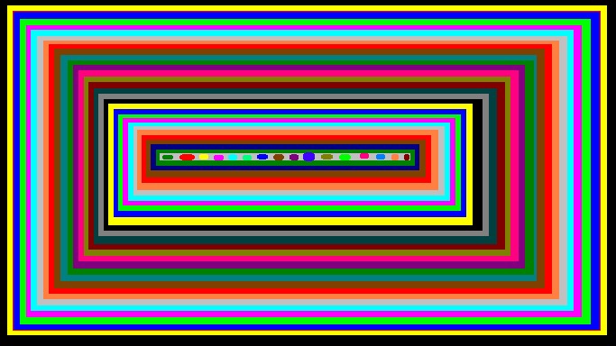
On my linkpage, I show that these first and last couple of images were done with a Microsoft Paint clone. The others were a painting application that was on my Nokia Flip.
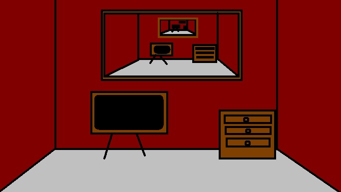
Unlike what I said in the Dalby Photoshoot, there's not really a lot to say about these. The last one was a colour test, this is a "we are all audience and performer" kind of thing
I had this thing about drawing faces.
This one is called "waiting room"
Love how smooth that is, given the tech.
I like the colour purple. Can you tell?
My attempt at making a skull on a Nokia flip (I had to colour fill that in, one pixel at a time)
A true test to see what my flip could do
This one is called "waiting room 2: wait harder"
An extension of the heart ones called "I Love You"
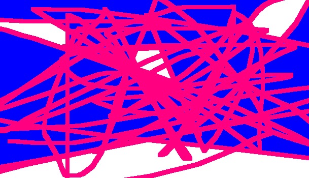
A usage of the colours of the Trans Pride flag to represent Gender Dysphoria.
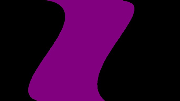
"Swirl" - kind of an example of my entire aesthetic
"Mess" - My "homage" to a lot of the kind of drawings I would actually make on MS paint back in the day.
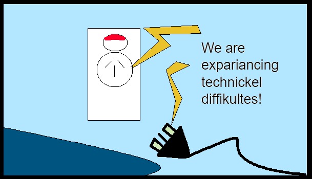
This is a joke piece of art. A silly piece about incompetence and technology. This one kind of just speaks for itself.
This is called "Stare At Me" - a painting I made with the specific purpose of testing colour theory.
This is my attempt at pop art but a legitimately more direct influence is actually the Rhapsody In Blue short film from Fantasia 2000
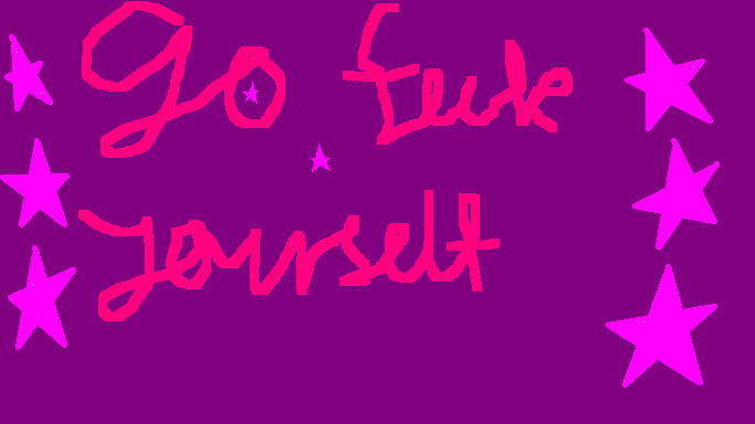
This is another joke piece. I'm letting this one speak for itself.
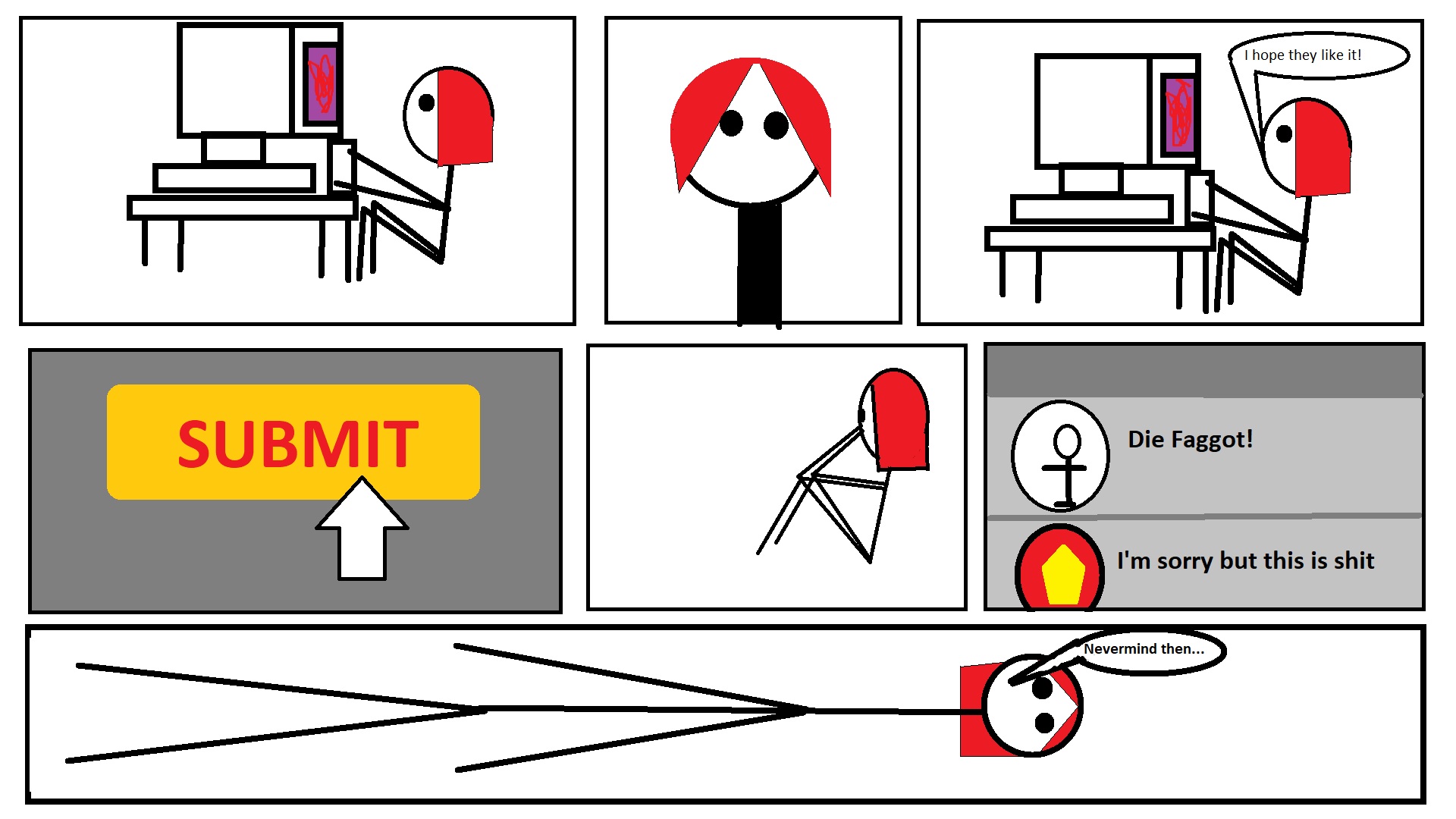
This is another "speaks for itself" comic but this is actually based on real events involving my art. I get people not liking my art but it still fucking sucks when you swing and miss.

This is a comic I made to express some feelings I have about the current state of the world. Yes, I admit I'm not American in that same comic but if you're unaware of just how America's outreach is global and has global repercussions, I can only conclude you are an American who has never even tried to empathise with a foreigner. That and I see my personal lived experience as being mundane enough that you COULD apply this to real trans people that exist in America in the real world right now. I don't know if this comes across but on the whole, I do try to promote empathy with my art. That is all this is. One big "I am more than a gender."
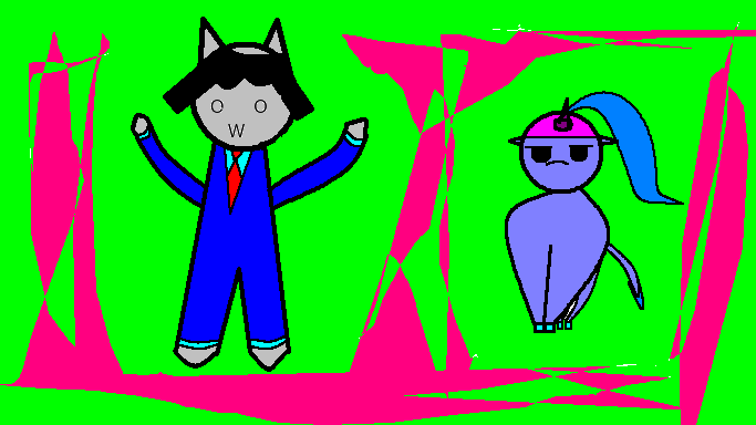
I decided to try and hone my skills as an artist by making fanart. I also did this as something of an experiment. If you've never seen Loveweb, the reliance on stock Windows XP sound effects is everywhere. So I wanted to see if I could make the characters in the Windows XP version of Microsoft Paint (to be clear, I mean this). I STILL acknowledge I'm not there yet with drawing characters in general (and the background was just "something to make the scene stand out more") but I don't hate the attempt, to be honest.

Call this self indulgent if you want but I thought it'd be fun show this. I upload all my drawings to Newgrounds and when I did the Loveweb fanart, I didn't really have any expectations it'd go beyond that. However, Shadok, the creator of Loveweb appears to have favourited my fanart. Now I know what my skills are as an artists and I KNOW she was probably(definitely) just being nice. That said, I can appreciate said "being nice" about my work.
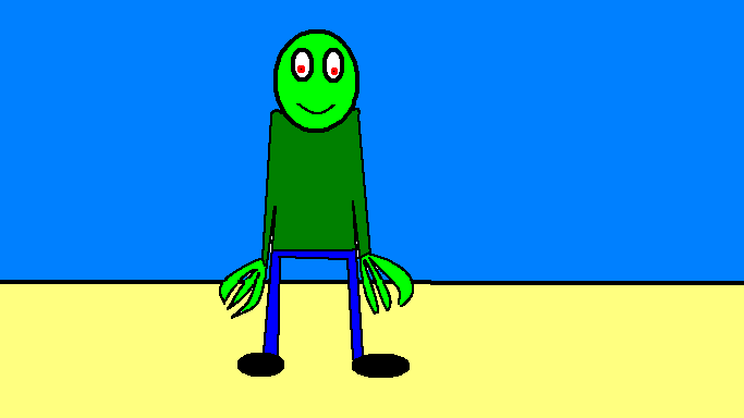
This is more fanart but of a more well known Newgrounds character, for those old enough, Salad Fingers was the definitive "weird, creepy internet video" from circa 2004. I actually do love the series but see the title character as being a representative of what extreme psychological trauma can do to a person.
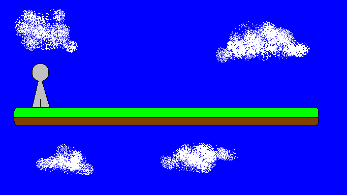
I've been a fan of Nicky Case's for a while and wanted to do fanart of her work - I want to do it for ALL the creatives on Newgrounds I admire. This is for her series The Game which I think still holds up in terms of humour. That and...it's about what I can draw from her work. I also added a punchline to make it FEEL more like the work.
.png)
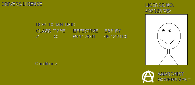
This is a form of protest art. I made a fake ID in Microsoft Paint and made it look as childish as possible. Why? I think these laws in the UK and Australia about censoring what websites people can and can't go on for the sake of "THE CHILDREN tm" is fucking stupid for MANY reasons (do I trust a third party company with my real ID? Do I trust the government with my real ID? Do I trust social media with my real ID? Even though data leaks and hackings happen ALL THE TIME!) and so I decided "I'll make an ID". The sad thing is I DO intend to upload these if and when these laws come into effect. Even if it's just for a joke.